Background
As a UX consultant for Qantas Business Rewards (QBR), I focused on improving the flight search widget to better serve Qantas Frequent Flyer (QFF) members who are also linked with QBR accounts. The project aimed to enhance the booking experience by allowing users to specify whether a flight is personal or business-related, thereby providing the appropriate loyalty benefits and permissions.
My role
Senior UX Designer
Tools
Sketch, InVision
Duration
5 months
Brief
Problem Statement
Before this project, frequent flyers needed to book directly through the QBR platform or to add an ABN at the end of the booking process to receive both QFF and QBR benefits. However, most Australians, being QFF members for personal flights, typically used the Qantas website to search and book flights. As a result, QBR members were missing out on points and savings. Changing user habits was difficult, so modifying the flight search widget on the Qantas website to allow a connection with QBR was deemed the best solution.
Stakeholders and Team Collaboration
This project was run in a true Agile environment with a dedicated team comprising a product owner, myself as the UX designer, a QA, a business analyst, a scrum master, and developers. The impact on elements like the flight search widget and the QFF account page, owned by other teams, extended the stakeholders involved during the research and implementation phases. I included these stakeholders in the ideation and research process, sharing outcomes and collaborating on different options.
Goals and Objectives
The primary objectives were:
- Assist and streamline the process of linking QFF accounts with QBR accounts.
- Enhance the flight search widget to allow users to specify the context of their travel (personal or business) efficiently.
- Improve user awareness and understanding of the benefits of linking QFF and QBR accounts.
Process
Research and Discovery
I conducted multiple rounds of usability testing, starting with guerrilla testing at the Sydney airport business lounge. This initial research involved QFF members who sometimes travel for business. We tested two options: a popup asking if the trip was personal or business and a checkbox saying "booking for my business XXX."
Round 1 Insights
- Popup option: Positively received for its clarity and guidance but noted for potentially slowing down regular flyers.
- Checkbox option: Preferred for its simplicity and integration but often overlooked by users.
In Round 2, we refined the options and tested them with QBR users. We presented:
- A popup showing personal and business trip options.
- An extended flight search widget indicating personal or QBR account with an option to change.
- A toggle at the top of the widget for business booking selection.
Round 2 Insights
- Popup option: Consistent and guiding but added an extra step, which could be negative for power users.
- Switch context options: Easy to switch without extra steps but the toggle/tab could be missed due to quick user navigation.
(Some QBR tested options)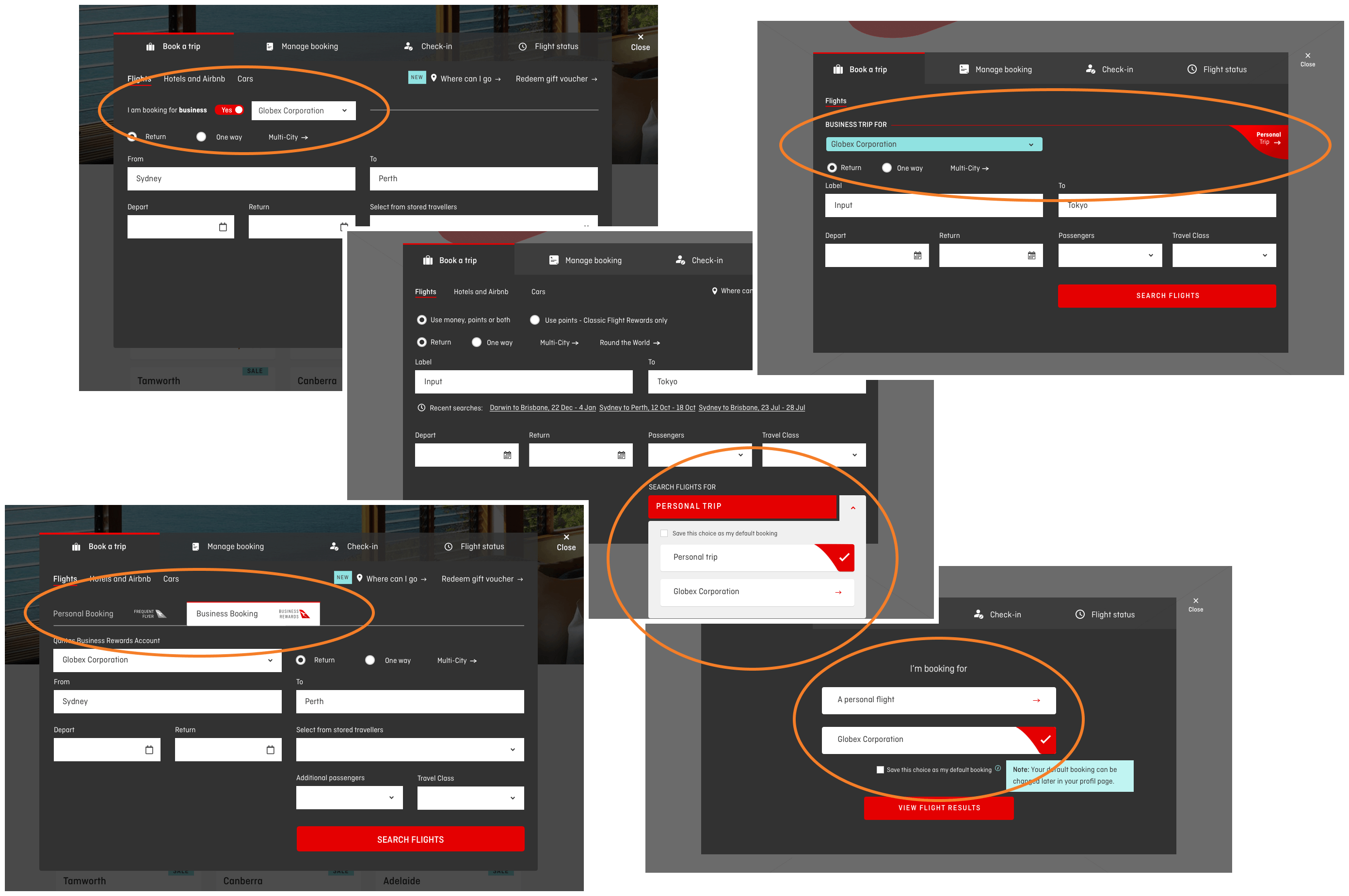
Design Process
These research insights helped define the design objectives:
- Provide guidance to ensure users don’t miss the option.
- Make booking as fast as possible.
- Facilitate easy switching between contexts.
- Allow users to set a default context.
- Minimise changes within the widget.
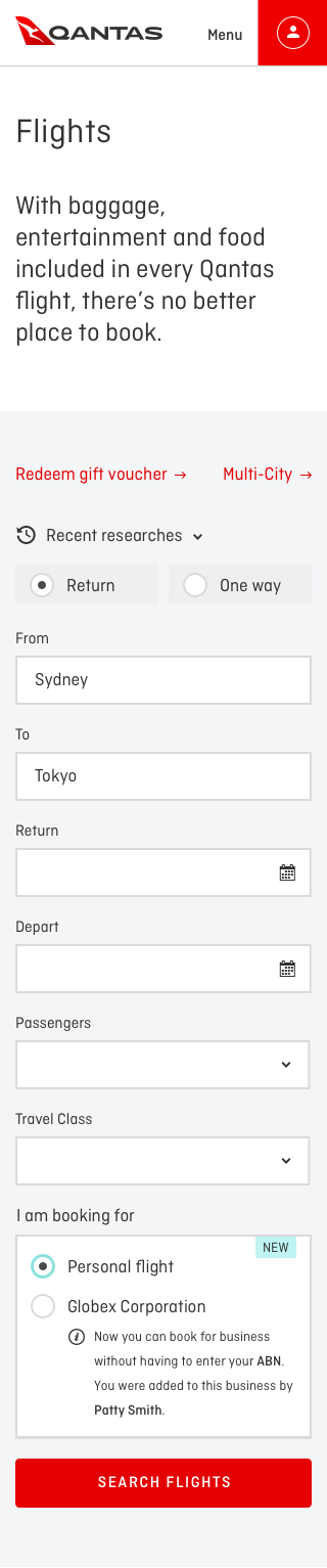
I designed multiple options to meet these objectives, ultimately validating the final design in the third round of usability testing. The chosen design featured a selector in the flight search widget close to the Search button (the call to action). This solution:
- Maintained the same CTA.
- Enabled easy context switching.
- Mirrored the mobile app experience.
- Added only a selector to the widget.
- Allowed for default settings from the user profile.
- Supported power users by retaining the latest context chosen.
(QBR flight search widget updated)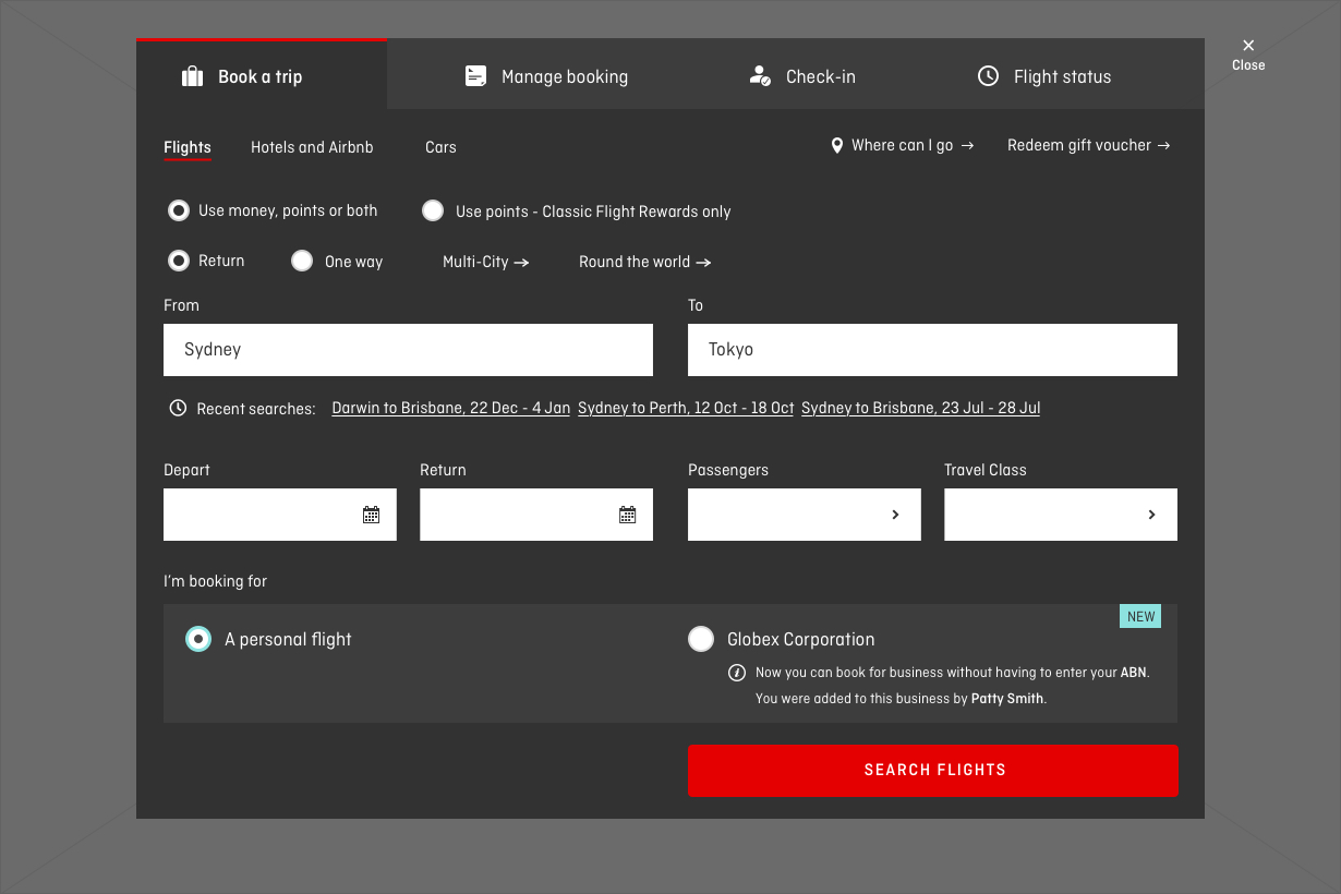
Implementation and Iteration
I created all the prototypes used in the usability testing rounds and delivered the signed-off designs to various teams for UI review. The Agile environment facilitated regular feedback loops and iterative improvements. Integrating feedback from stakeholders and ensuring alignment across teams were crucial for the successful implementation of the enhancements.
Prompting QFF Members to Link Accounts
In addition to enhancing the flight search widget, I participated in the research and design of the process prompting QFF members logged into Qantas to link their accounts when nominated by a QBR account. This involved creating a seamless flow to encourage users to connect their accounts, thereby enhancing their travel experience by leveraging the combined benefits of QFF and QBR. A visual illustrating this process at a high level is available, though this is not the focus of this case study.
(QFF linkage process with QBR)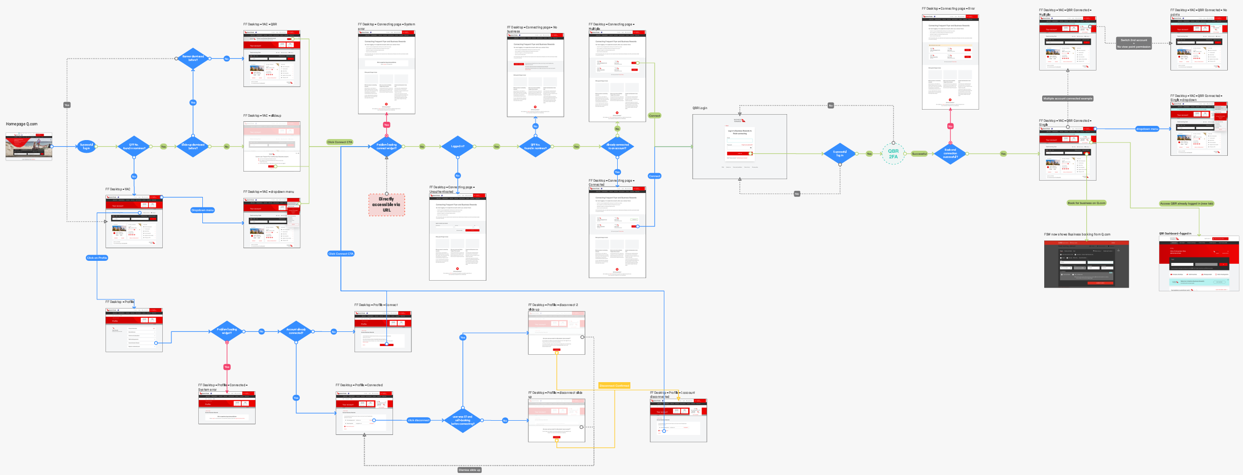
Outcome
The enhanced flight search widget significantly improved the user experience for QFF and QBR members. Users could now seamlessly choose between personal and business travel contexts, ensuring they received the appropriate loyalty benefits. The design changes were well-received, with positive feedback highlighting the clarity and efficiency of the new widget. Although specific KPIs and metrics cannot be disclosed due to NDA, the enhancements led to a significant increase in the number of flights searched and booked associated with a QBR account. This improvement translated into better prices and more Qantas points for frequent flyers and companies. The final design is still in use on the Qantas website, underscoring its success.
Takeaway
This project underscored the importance of user-centered design and iterative testing in developing effective solutions. The research phase was crucial in understanding user needs and refining the design to meet those needs. The Agile methodology enabled efficient collaboration and continuous improvement, ultimately delivering a solution that enhanced user satisfaction and engagement. An interesting insight from the project was that the initial idea was the right one, but testing other options with users provided the data needed to justify it to the team and stakeholders. This demonstrated the critical role of user research in making objective and informed design decisions.