Background
The reporting application was difficult to use and cluttered, resulting in a poor user experience and disengagement with the user community. Users struggled to find information due to the application's challenging navigation. This led to frustration and wasted time, with most users reverting to Excel to manually extract answers from the available data.
My role
UX, UI, Research, Prototype, Usability Testing
Tools
Sketch, InVision
Duration
4 months
Understand
Current state
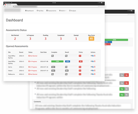
The existing reporting application had been modified and extended over time as new requirements arose. This was done without a clear vision and without consideration of how the dashboard would be used. After many versions, screens looked more like silos, each corresponding to a change request, resulting in a clumsy and difficult to navigate dashboard.
(Old dashboard overview page)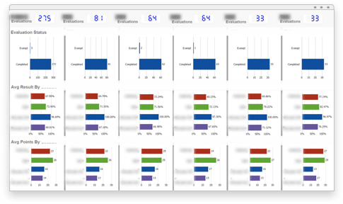
Research
Initially, I ran a usability evaluation to assess the current state of the application. Mapping out all the screens, their content, and types of visualizations helped me identify redundancies and inconsistencies, revealing how confusing the screens were for users. After several interviews with key users, I summarized my findings and business requirements into different personas.
I also found that many data visualization choices were not aligned with their purpose, making it difficult to gain insights. Additionally, some data was represented without context, which could be misleading and result in poor decision-making. I researched which data visualizations would allow users to gain quick insights for different types of data.
(Data visualisation research)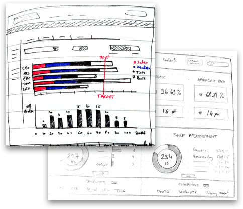
Create
Prototyping
After refining my wireframes with key stakeholders, I built a high-fidelity dynamic prototype to validate my design. I conducted workshops across the country with different user groups to present the new vision of the application, focusing on addressing users' needs. I also held several usability testing sessions to gather more feedback.
(New overview page)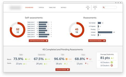
My vision for the new dashboard landing page was very well received. It presented a clear view of the high-level business overview and provided quick access to further analysis. The new visualizations, in the form of gauges, colored indicators, and bar charts, were easy to consume and provided instant insights.
(New analysis page)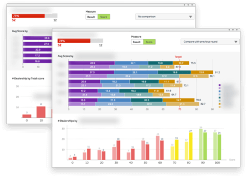
The same positive feedback was received about the new screens, which offered a better understanding of the business. Users could easily slice and dice their data with dropdown lists or toggles to seamlessly analyze various scenarios. Additionally, the chosen color scheme was consistent throughout the entire application, providing power users with visual information without needing to refer to a legend.
Impact
Frictionless, intuitive and rich
The new design fostered a better relationship between users and their data. Users found the new application intuitive and easy to use. They felt supported by the application and empowered with the right tools for each activity. After two months, the adoption rate was over 90%.
"Our dashboard is now something that I can easily use and that really bring value. I quickly find all the answers I need. It's really simple to get the full picture as well as digging down to the very details of my data."
Build Trust
Within a few months after the launch, the user community trusted the application. Users requested to extend the scope and to incorporate more governed data, allowing them to rely on one efficient and easy-to-use dashboard for various types of data across different departments.
I leveraged my knowledge of the business and applied my previous user research to optimize the design process and accelerate the development phase. As the application grew in scope, a new navigation with two sub-levels was required, giving access to additional business departments.
Future
Over the past two years, I have maintained regular communication with all stakeholders involved in this project, fostering an efficient and open relationship. I am now working on a new web-based application that will provide the same seamless user experience on any device. This application will manage the data input that feeds the enhanced analytics dashboard.
(Beta mobile version screenshots)