Portal
Background
At Dendra, I led the comprehensive redesign of the portal, transforming it from a simple data repository into an intuitive, user-centric platform capable of scaling and integrating new functionalities such as the Management Suite. Dendra uses customised drones to capture imagery, which GIS specialists process for tagging, identifying data requested by clients, such as weeds, erosion, native flora and fauna, and creating topographic maps.
My role
Senior Product Designer
Tools
Figma, Miro, MixPanel, Google analytics
Duration
9 months
Brief
Problem Statement
Dendra's vision is to provide the analysis and GIS data necessary to understand the current ecological situation, plan, track progress, create actions to meet legislation requirements, and achieve ecosystem restoration goals. However, the existing customer-facing platform was primarily used for downloading data, with users relying on other tools for analysis. Accessing desired data layers was tedious and overly focused on NSW regulations, limiting its usefulness and user engagement.
(Old Dendra portal) 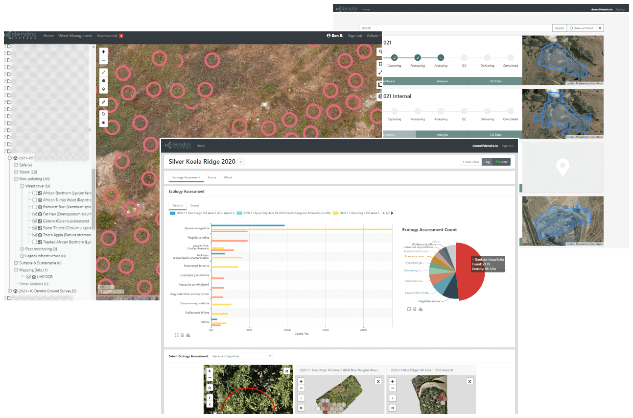
Stakeholders and Team Collaboration
I worked closely with the head of product to define the product strategy and roadmap. Collaboration extended to our internal specialised scientists and the development team to ensure alignment and feasibility. Regular interactions with these stakeholders were crucial in shaping the direction of the project.
Goals and Objectives
The primary goal of the redesign was to transform the GIS portal into a tool that users would return to regularly for data analysis and informed decision-making. The objective was to encourage frequent use of the portal, moving away from the existing pattern where users accessed it once a year to download data for use in other tools.
Process
Discovery and User Research
During the discovery and ideation phase, I conducted multiple user interviews to gather insights and understand user needs. Access to customers and field experts, along with our internal specialists, provided a comprehensive understanding of the challenges and opportunities. This research phase was instrumental in identifying the key pain points and user requirements that would drive the redesign.
Navigation
To address the limitations of the old navigation system, which was neither scalable nor user-friendly, I created a detailed sitemap to capture the entire scope of what the portal could and would offer customers. This clear vision enabled me to design a new navigation system for both the customer-facing side and internal use. The new navigation was anchored with primary navigation on the left and secondary navigation at the top, maximising content visibility and accessibility.
(New left main and secondary top navigation)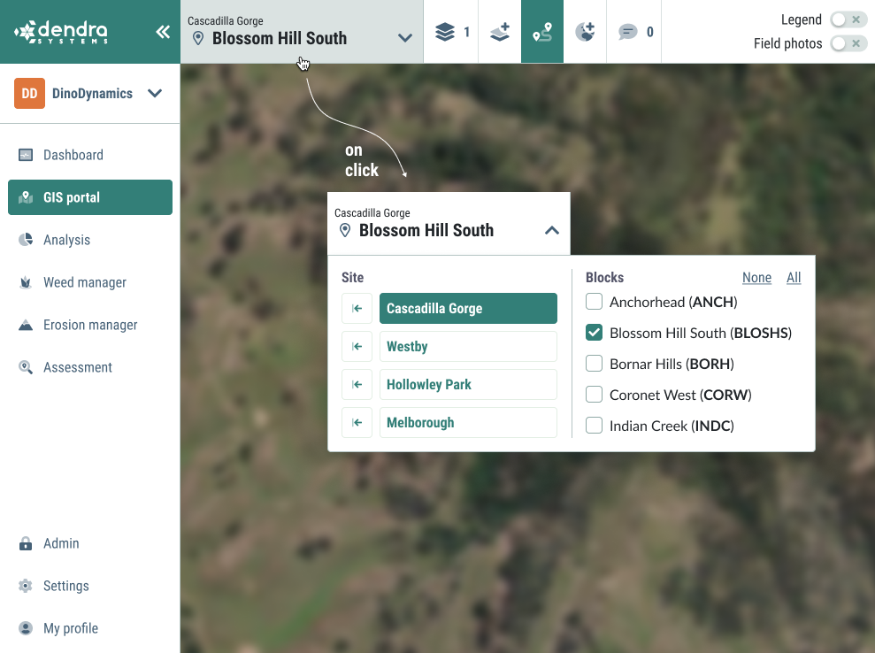
Information Architecture
A significant change was the reorganisation of the data structure from a contract-based format Contract > Year > Site to a more intuitive mapping of Organisation > Site > Block. This shift aligned with the mental models of our users, allowing them to easily find the information they needed without recalling specific contracts. This restructuring had a substantial impact on the UI, ensuring that data was explicitly tied to the location and survey time, with a consistent visual hierarchy. I established rules to distinguish fixed UI elements from customer data, reducing ambiguity and enhancing recognisability.
Design System
To support the new design, I created Dendra’s first design system using the atomic approach. This system defined all UI elements, colours, buttons, icons, font sizes and families, inputs, KPIs, tags, navigation, and containers. The design system ensured consistency and scalability, allowing for streamlined implementation and reducing the design workload needed for handover to the development team.
(Dendra's new design system snippet)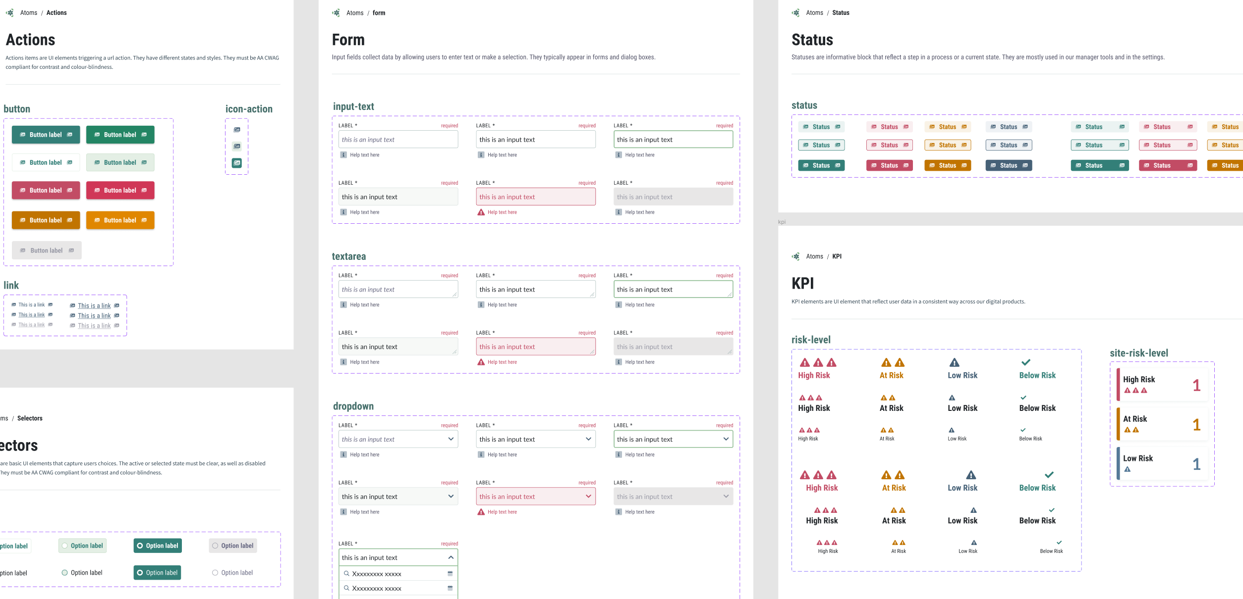
Usability Testing
During usability testing, I personally conducted remote sessions using prepared prototypes and user scenarios. Initial findings revealed that the data layers, originally based on NSW regulations, were confusing to users from other states due to different hierarchy and unclear terminology. Simplifying and clarifying the layer structure made it easier for users to find the data they needed. Another key takeaway was the need for better information sharing between users. In response, I designed a new annotations feature that allowed users to share the exact same view with authorised users and included a conversation capability for asynchronous collaboration.
Implementation
The task of redesigning the entire portal was challenging for our small team. We compromised by updating the portal one module at a time, minimising user disruption. However, there was a period when both the old and new UIs coexisted. Prioritisation was based on user needs and was more straightforward to apply to newly created features and modules.
(New GIS portal - Active layer management)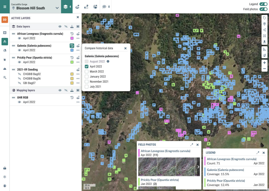
(New GIS portal - Annotation creation)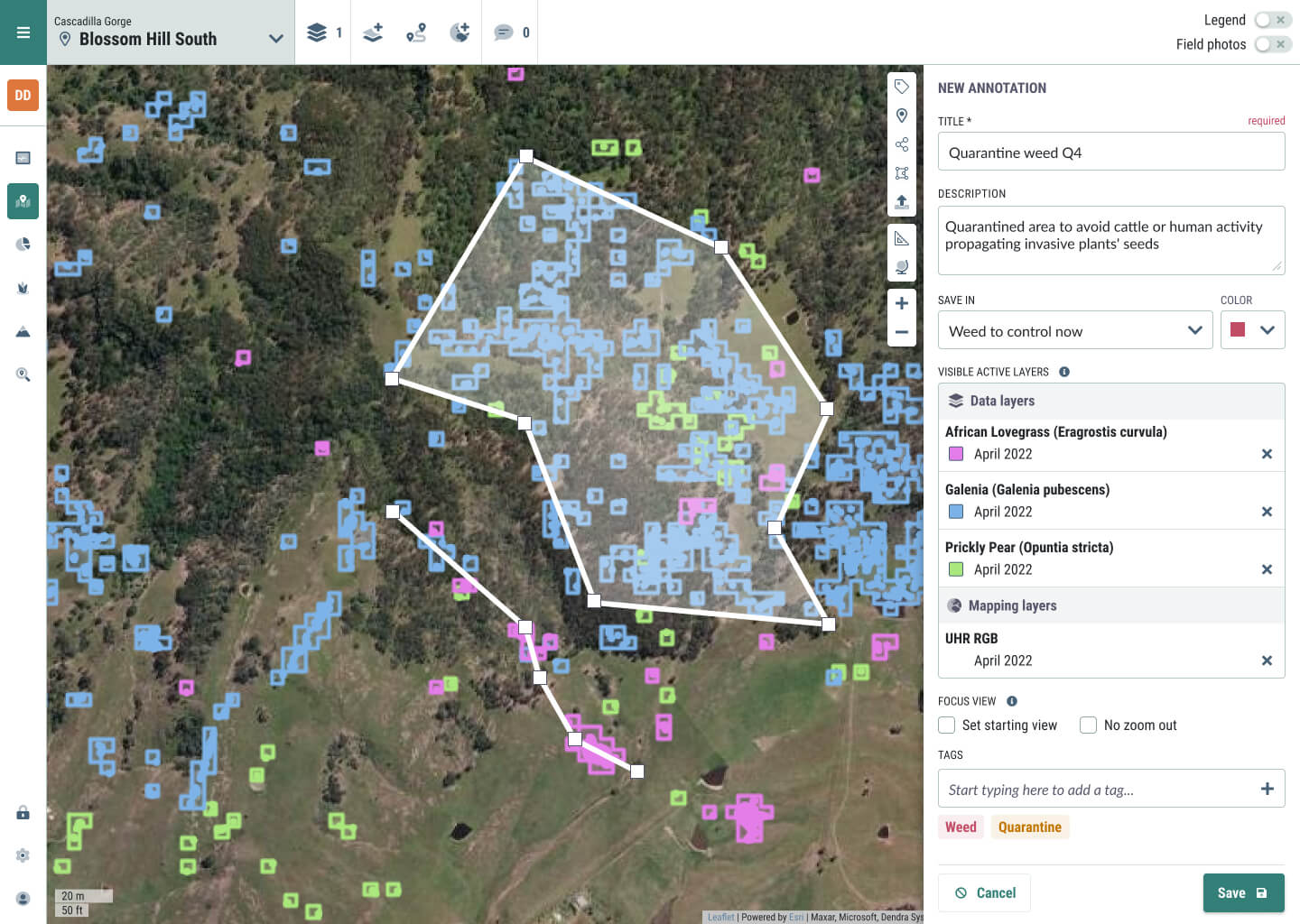
Outcome
The complete redesign transformed the user experience of the portal, resulting in a 310% increase in monthly connections. Users now start from the physical location and focus on areas and activities, following a logical workflow for daily tasks. The new Organisation > Site > Block hierarchy unlocked KPIs at each level, providing both a bird's-eye view and enabling overall trend analysis, which are crucial for prioritisation and planning. Additionally, the new navigation enabled the development of the Management Suite, central to the product vision, and facilitated finer user access permissions to meet privacy requirements.
The updated data structure, focusing on user-driven analysis and reporting, prepared the platform for worldwide deployment. Users were placed in the driver’s seat, significantly enhancing their ability to analyse and report on the data.
Takeaway
Becoming user-centric was a major transformation for the small, newly formed product team. This shift built a solid foundation for the future of Dendra's portal and fostered stronger relationships with users. Despite the excitement from customers, the delivery of the new experience was slower than expected due to technology changes and a busy development team. Consequently, the updated design was implemented incrementally, resulting in a transitional experience where new and old designs operated concurrently.