
Touch Payments believes the eRetail industry needs reinvention. As the alternative to other digital payment systems, Touch Payments addresses the most inconvenient aspect of online shopping: the inability to try before paying. By creating a ‘try-before-you-buy’ offer, they gives customers the choice to deal with online shops on their own terms, much like they would in a brick-and-mortar shop, at no added cost for online shops.
User Experience, User Interface
Touch Payments

Recent research showed that purchasing online is still facing a massive dropout rate during the checkout process. In fact, out of 100 people that start the checkout process, only 26 will actually complete their purchase. On mobile devices it’s even less, with only 3 people completing their purchase. The main reasons are:
Nowaday, people are shopping across multiple devices but the conversion rate on mobile devices is minimal in comparison to conversion on desktops. Mobile shoppers do not complete a purchase because:
Touch Payments provides a fast and safe checkout experience with no credit card, pre-registration or password required. This seamless process means less friction and increased conversion on all devices. The only restriction is a credit limit that is allocated to each customer based on a real-time scoring algorithm that define a risk profile.
Below this credit limit and with just a few personal details, a customer can purchase instantly, be delivered and has 16 days to pay for what he keeps! By doing so, Touch Payment addresses the 3 major frustrations of online shopping.
When a customer reaches his credit limit during a checkout process, the current system will not allow the try-before-you-buy offer. Instead, it will ask for an immediate payment of the current order to finalise it. Most of users' feedback was pointed out this as a major issue that needs to be addressed.
The lack of options in this situation resulted by loosing the customer and a potential sale. The process needed to be updated in order to provide additional options to users that still want to benefit from the try-before-you-buy offer.
Touch Payments reward customers that connect their social media account by increasing their credit limit. However, this was only available for returning customer from their Touch Payment dashboard. By including this feature inside the checkout process, we would allow new and returning customers to influence their credit limit when they need it the most and without exiting the checkout.
For returning customers, reaching the credit limit means that they potentially already have outstanding orders. Yet, the checkout process will only ask for an immediate payment for the current one. Another new option need to give access to previous orders. So they can choose to pay one or more of them, therefore lower the outstanding credit amount and be back under the limit again. Allowing them to benefit again from the try-before-you-buy offer.
I first started by mapping all the interactions that a customer is going through during the checkout process. Creating a simplified user flow to understand where the new features will fit in and try at the same time to keep the process as short as possible.
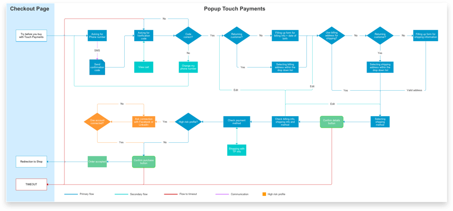
It was also very helpful to have a visual that synthetise the path of least resistance, as well as the different loop for new or returning customer, high risk profile and where timeout could happened.
Touch Payments is taking a financial risk for the shop by giving 16 days to the customer before paying for only what they keep. Therefore, a transparent communication is in place to clearly inform the customer about his current orders status, credit situation, returning process status, when orders are due and their payment informations.
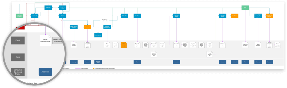
It was crucial to understand what the status of an order presented inside the customer dashboard means after being approved. Email is the preferred media to notify order status and send reminder for payments. Nevertheless, before a critical threshold, when fees are going to be applied, SMS reminders are used to maximise the user awareness.
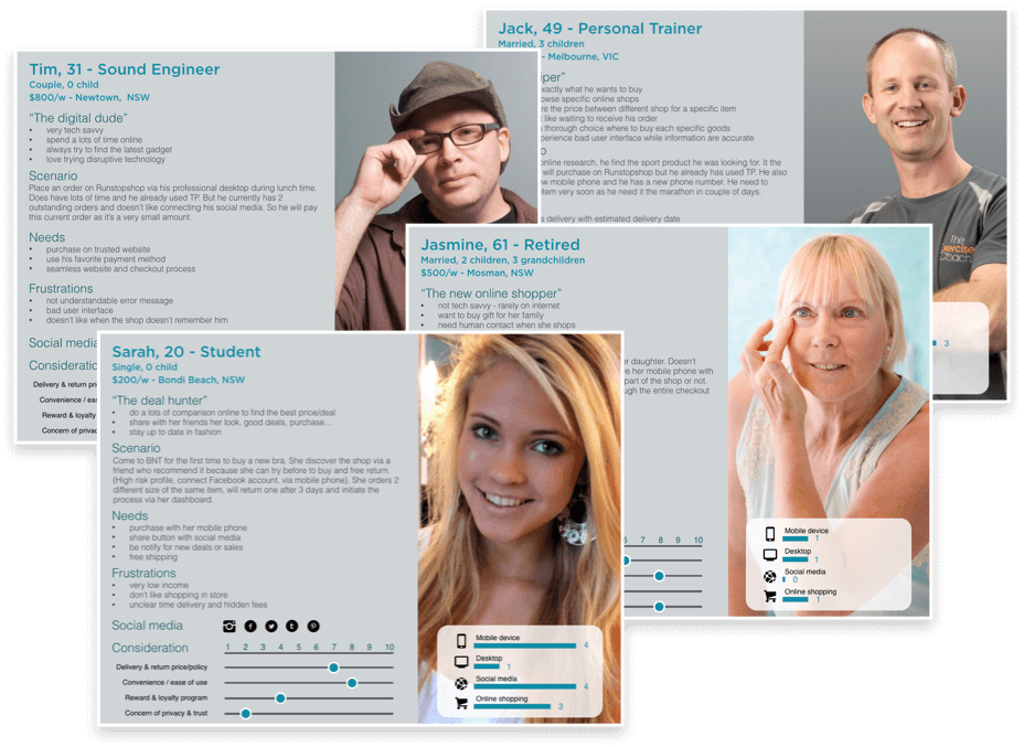
The most important design tool was the creation of the personas to summarise all the finding from the data analytics, the support team and user interviews. I could put together the most represented behaviours, around needs, frustration, social media used, most important considerations to purchase and devices used. Touch Payment's focus is on mobile shoppers that are usually more frustrated, but as a shared responsive checkout solution, desktop buyers are crucial to the business.
The backend system will calculate the total of the order and check if your total outstanding amount is exceeding your credit limit. If the customer is in this case, I designed a new screen that will give 3 different option to the user. The first option will show which social media can be linked to the account and how much they will increase the credit limit. The user can also access the previous order by clicking on "details", underneath his total spending amount.
The third option will directly prensent all the constituant of the outstanding amount, including previous order and the current one.
Here is an extract of the new screen flow when the credit limit is reached for a returning customer. His contact details and default billing and shipping informations are automatically populated. Only the shipping method is asked to minimise the user input and the checkout process.
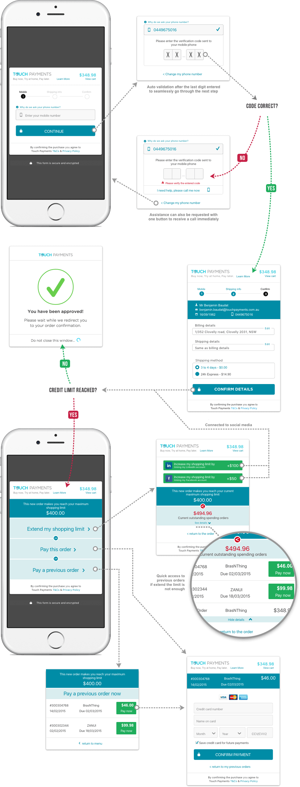
When a customer needs to extend his credit limit, I chose to present all the information that he needs to make a decision. He can see which social media can be linked to the account and how much they will increase the credit limit. Just below, the summary of his credit situation with his maximum shopping limit and the total of his outstanding spending orders. Returning customers can also access to their previous orders with their details and total amount. It is then easy for the user to decide if it is more interesting to increase the limit or pay a previous order, that will then allow him to benefit from the try-before-you-buy offer. Otherwise, he can go back and pay the current order.
My main goal here was to design screens with a maximum of information that will help the user to understand his financial situation with Touch Payment. Being transparent is at the core of Touch Payment values and give the responsability to the customer to make his own choice.

I ran usability testing with returning customers and potential future customer, on a staging environment to simulate real experience and data. I receive very positve feedback with 68% of the users would connect their social media during the checkout process to finalise an order and use the try-before-you-buy offer.
Besides, 59% of the returning customers would pay a small previous order to also benefit the offer. Howerever, a majority of the users said that it could be confusing to pay a previous order, that most probably has a different amount and finally, to confirm the current order during one same checkout process.
I was also working on the customer dashboard to give even more flexibility and capacity to the user that will influence his shopping experience. I was working an a first version of a gamification system that will reward customers that have used Touch Payment multiple times. Giving access to badges that grant access to new rewards as incentive accross all the shop that offer Touch Payment as a payment method. For instance, paying X orders before their due dates could give access to a Voucher, or answering feedback surveys would increase the credit limit etc...
(early stage research wireframe)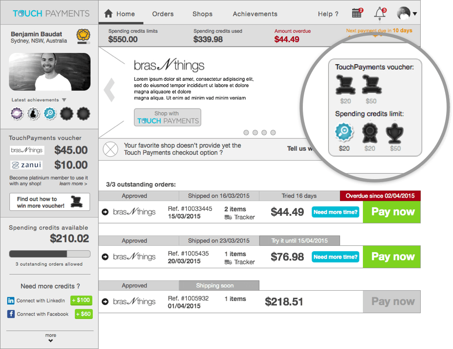

 LinkedIn
 Behance
