
Two years ago, Satsumas realised the real-world value of User Centered Design (UCD) Principals and this changed our approach when developing Business Intelligence (BI) projects to our clients. This allowed us to deliver easy-to-use and visually appealing dashboard applications, using intuitive visualisations to support data driven decisions through data discovery and self-service analytics.
Satsumas decided to apply this same approach to their company website, using the lessons learnt about the power of UCD while making it easier for clients to navigate and get understanding about our business. We decided to do this in-house to make sure that the project was brought in on time, under budget and reflected our companies unique approach to data and design.
User Experience, Ilustration
Satsuma Solutions

A key starting point was to clearly articulate the role of our company website. By conducting workshops with the executive and marketing teams, 3 objectives were identified:
My next step was to assess whether our existing website was aligned with our company philosophy. I analysed our Google Analytics data to understand user behaviour and I found areas that needed improvement. The home page had a high bounce rate and the contact page was visited by 4% of users with almost no conversion. Most importantly, the pages that presented our services had short visit durations indicating a lack of user engagement.
I set out to identify what was leading to the lack of user engagement. The home page had a large slider with little explanatory text (only short tag lines) and some call-to-action links and a title. There wasn’t enough information for users to know what we did as a company. Anyone visiting the site would have had difficulty understanding what services Satsumas was offering. This could have been resulting in the high drop-out rate on this page.
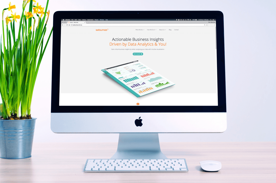
To address this problem, I suggested to get rid of the slider entirely. Instead, I recommanded to immediately offer an explanation of what we do, include a call-to-action and then a visual element that would summarise the services we provide. I had to make sure we provided easy access to key pages on our site such as "Why Satsumas" (the most visited page on our site) and drive the users to other pages in an effort to keep them engaged.
(early wireframe of the home page)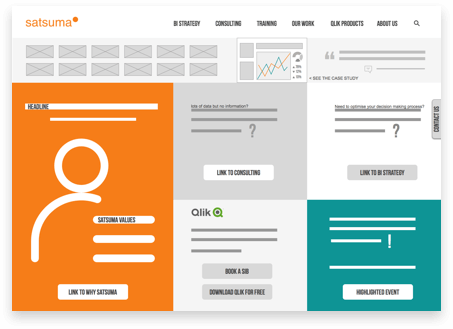
While reviewing our old website, I noticed a counterintuitive behaviour with our “Contact Us” link. Depending on which link was clicked (from the menu or a button inside a page) the form was presented either in a pop-up window or a full page. It was even possible to be on the contact page and make the contact form pop up on the top of it. I proposed to simplify this page and removed the pop-up window entirely to avoid confusion.
(contact us page wireframe)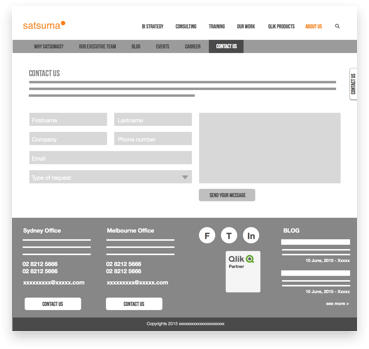
It was difficult for users to find out exactly what services we offered and once they landed on a relevant page, there were large text heavy blocks that were boring and not at all engaging. I had to find a way to make it easy for users to understand what we do, how we do it and who we are. I concluded our sites navigation should include links called ‘What we do”, “How we do it” and “About us” in addition to the “Home” page. This made it easy for any first-time visitor to navigate our website.
I also asked the marketing team to rewrite the text in a shorter, more concise and easy to consume way. I wanted to give users easy access to what our company can offer them. I also decided to include more visual elements to give them immediate understanding.
When I combined my data analysis with the website review, it was clear that a simple update would not be enough. The website needed to be redesigned and rebuilt from scratch to make it align with its purpose and support the business. We did not anticipate this conclusion as the website was only 1-year old. It had been built by a third-party website design and marketing agency and we let them take the lead on the website design as they were the experts and we were time poor. It was now time to take back control and apply the same design principles that we know to be so successful in our BI solutions to our own website.
The executive team decided to move forward and create a brand-new website, that could be a real asset to the business and correctly represent the company and our approach to analysing data. The research phase was critical as it gave us an understanding of what was and wasn’t working. Making sure users could access the information they were looking for was critical to engaging them in the website and ultimately our company. This was our primary goal.
I decided to reduce the number of pages to make it easier for users to navigate and find required information. I also reduced the amount of content available so that there would be less to navigate. The language on the site was simplified and made less technical in order to make it more accessible to all users. I also dramatically simplified the menu on the website, reducing the number of levels from 3 to 2 making it much easier for users to find the content they were looking for.
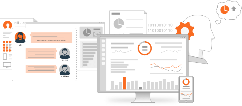
In an attempt to reduce the amount of text on the site, I created clear illustrations to outline the innovative process that we use to better service our client’s data analytics needs. This powerful illustration makes it easy for users to understand our process and how open lines of communication with our clients leads to better BI solutions.

I also chose to illustrate “What we do” to demonstrate how working with Satsumas can give clients access to insights in their data, leading to better informed business decisions. Other spot images around the site were also created to support our message. After all, a picture is worth a thousand words.
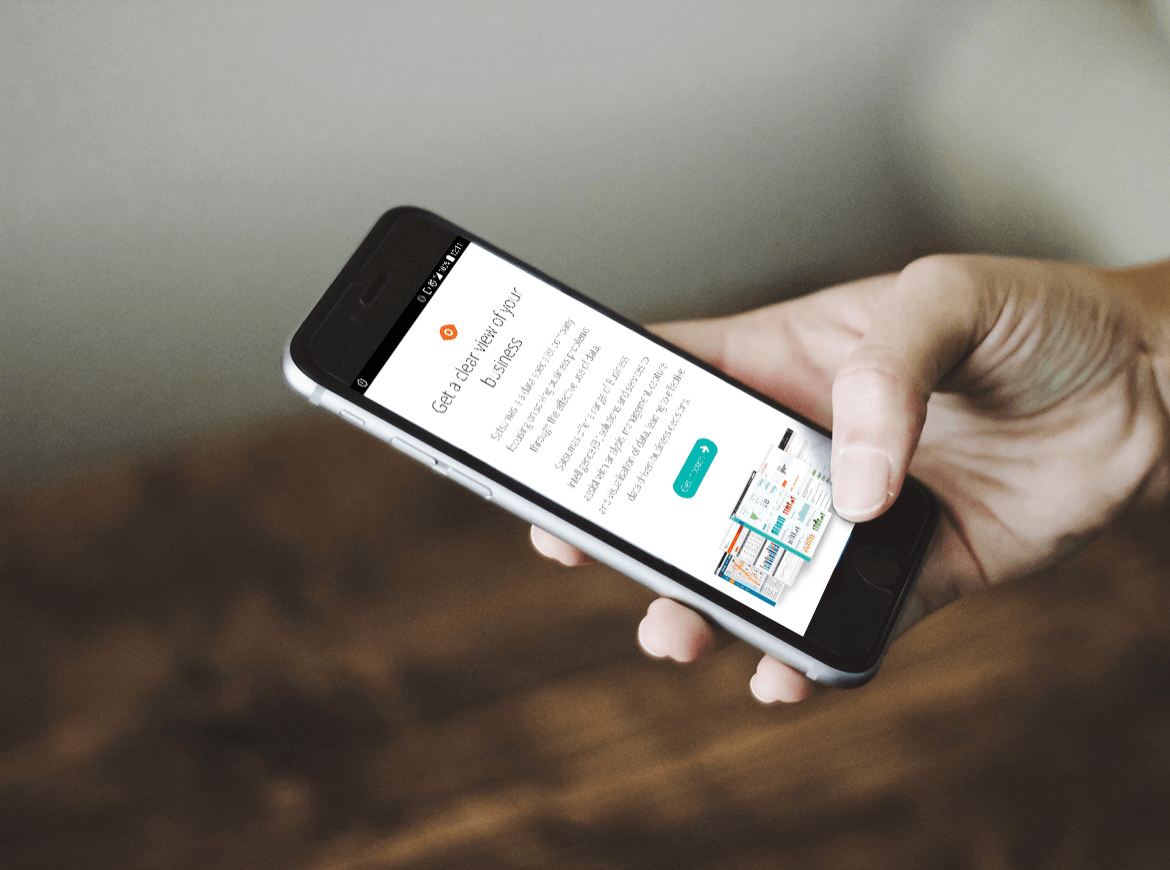
The visual recommandations were to use more white space to emphase the new content. Additionally, I recommanded to have long scrolling pages with anchors to navigate through them that will create a smooth experience on desktop and mobile. It was also important to provide a quick access to what Satsuma is providing, which is now the case with the more detailed home page.

A few months after the launch of the new website satsumas.com.au, we could see the benefits by looking at Google Analytics. New session times have increased by +65% and unique page views have increased by +22%.
Most importantly, the traffic to the Contact Us page has increased by 5 times.
By applying best practice UCD Principals to our own website, we have improved the messaging on our website, increased traffic to the site, increased the duration of page views and have driven more users to our contact us page.
By making our website easier to find, navigate and read we have increased user engagement. This was a valuable company exercise that has already paid off.

 LinkedIn
 Behance
